What Role Does Analytics Play in Mental Health Research?

What Role Does Analytics Play in Mental Health Research?

What Role Does Analytics Play in Mental Health Research?

Authored by Ayesha Rajan, Research Analyst at Altheia Predictive Health

Introduction

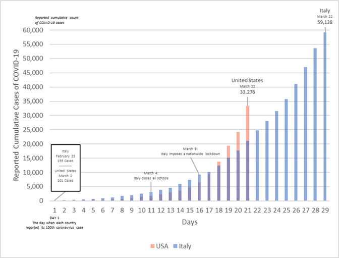
May is Mental Health Awareness Month, an especially important topic this year as we as a society continue to navigate the coronavirus pandemic. Mental illness is incredibly prevalent in the United States with 1 in 5 adults (43.8 million people) experiencing mental illness and 1 in 25 (9.8 million people) experiencing mental illnesses that limit their ability to live a normal life (Coleman). Furthermore, as people across the country and world currently face the struggles of social isolation and job uncertainty, they report significantly higher incidents of negative mental health effects (Panchal). Clearly, there are a great number of people who would benefit from further developments in mental health research. While the study of analytics as it pertains to mental health is a fairly new field, there are many promising reports and developments that we will discuss here.

Key Points

When looking at mental health from a data standpoint, there are several approaches to a mental health study. Unlike the monitoring and analysis of conditions like coronary artery disease or diabetes, many current mental health studies focus on factors outside of the metabolic panel such as tracking a patients’ actions, words, facial expressions and non-verbal cues to make predictions about behavior.

While many of the studies detailed here do not look at physical health as a factor in their research, it is important to know that depression and mental illness is more common amongst those with chronic illnesses such as: cancer, coronary artery disease, diabetes, epilepsy, multiple sclerosis, stroke, Alzheimer’s, HIV/AIDS, Parkinson’s, lupus, and rheumatoid arthritis (NIMH).

Research Studies

The Crisis Text Line is a crisis counseling center that receives text messages from people experiencing mental health instability and those who may be considering self-harm or suicide.  It then connects them to counselors via text message – a form of communication that can be more comfortable than a phone conversation for many people. Crisis Text Line has collected and analyzed the language patterns over 30 million text messages to analyze trends in those who were more likely to self-harm or commit suicide. What they found was a wealth of key words, such as the word “Advil,” that indicated a person’s risk of committing suicide. Interestingly, none of the key words included those that were previously considered high risk (DDS).

Another fascinating study came out of the University of Southern California where researchers created a virtual therapist called “Ellie.” Ellie captures and analyzes facial expressions and non-verbal cues and uses artificial intelligence to learn to detect the presence of mental illness. In the study, Ellie was more effective than a routine health assessment at detecting Post Traumatic Stress Disorder in military personnel returning from tours in Afghanistan (DDS).

Kaiser Permanente has also conducted research in this area. They successfully built an analytics model that predicts the 90-day suicide risk of patients visiting a mental health professional. The model took in behavioral patterns such as prior suicide attempts, substance use, emergency room incidents and a questionnaire, as well as medical and mental health diagnoses and prescribed medication, as variables for the model. The model was able to identify the top 5% of those with the highest risk of committing suicide. It has created a great foundation for tracking and protecting patients with mental health issues (DDS).

Where Can Analytics Take This Field?

Many mental illnesses are the manifestation of both natured and nurtured inputs. Consequently, the study of data science as it relates to mental health will continue to see a synergy of biological and behavioral inputs that are factored into predictive algorithms as variables. We will likely see more studies take on a biostatistical approach for many of the biological factors related to mental illness including those discussed above. Other factors that show promising abilities to predict and track mental illness include neurobiological mechanisms such as biomarkers from brain imaging, neurocognitive task assessment and psychometrics as they relate to biological aging (Wall). Artificial intelligence can do a lot of the heavy lifting in determining which factors, biological or behavioral, carry the most weight in prediction, prevention, and management. Given the fact that artificial intelligence tools are becoming more and more mainstream, we can likely expect to see many exciting developments in this field.

How You Can Look After Your Mental Health During the Pandemic

The World Health Organization has listed the following items as methods to cope with the stress and anxiety surrounding the COVID-19 pandemic:

  1. Stay informed by checking the news once or twice a day
  2. Keep a routine by maintaining your previous routine or creating a new routine
  3. Maintain a healthy lifestyle be eating healthy meals, exercising regularly, getting enough sleep, and maintaining           personal hygiene
  4. Maintain social contact by checking in on and catching up with friends and family
  5. Limit screen time in terms of video games and social media
  6. Limit alcohol and drug use

Making sure that you are checking in with yourself and monitoring your mental health is always important, but it is even more so as we all face the struggles of a pandemic. By taking care of your body and ensuring you have enough time to rest, you can set yourself up to adapt to a trying situation. Additionally, be sure to reach out to love ones and check in on them as well.

Free Tools Available

There are several free tools for mental health available. We have consolidated few resources below to help you navigate to these resources.

Works Cited

Chronic Illness & Mental Health.” National Institute of Mental Health, U.S. Department of Health and Human Services, www.nimh.nih.gov/health/publications/chronic-illness-mental-health/index.shtml.

Coleman, Madeline. “Mental Health and Big Data: A Step in the Right Direction.” RxDataScience Inc. – Data Science for Healthcare, 6 May 2020, www.rxdatascience.com/blog/mental-health-and-big-data-a-step-in-the-right-direction.

Panchal, Nirmita, et al. “The Implications of COVID-19 for Mental Health and Substance Use.” The Henry J. Kaiser Family Foundation, 21 Apr. 2020, www.kff.org/coronavirus-covid-19/issue-brief/the-implications-of-covid-19-for-mental-health-and-substance-use/.

“Using Data Science to Help Tackle Mental Health Issues.” DiscoverDataScience.org, 16 Mar. 2020, www.discoverdatascience.org/social-good/mental-health/.

Wall, Melanie. “Mental Health Data Science.” Columbia University Department of Psychiatry, 3 Mar. 2020, www.columbiapsychiatry.org/mental-health-data-science.

Use of Analytics in Prediction and Prevention of Coronary Artery Disease

Use of Analysis in Prediction and Prevention of Coronary Artery Disease

Ayesha Rajan, Research Analyst at Altheia Predictive Health

Introduction

Coronary artery disease (CAD) is a chronic, comorbid condition that is usually the result of plaque buildup leading to limited blood flow. CAD is the leading cause of death and loss of productivity in the United States due to an aging population and globalization/ urbanization. It is expected to be responsible for over 20 million global deaths by 2030 (World Health Organization). As a result, CAD is clearly an issue that needs attention in terms of preventative care. While there currently exist many different prediction tools, most of them are severely lacking in the use of data points that are correlated with the presence of CAD.

Key Data Points

The table in Figure 1 shows normal, at risk, high risk and highest risk (when possible) ranges for key points in a typical metabolic panel. If you could only look at a limited number of factors to predict and prevent CAD, these would be among the strongest points and are the basic data points included in most current predictive models. However, looking specifically at LDL cholesterol, as well as presence of diabetes or chest pain, cigarette-use, sex, race, and age can provide even more context and accuracy. One could cast an even wider net for more data points and include the results of a resting electrocardiograph, existing exercise induced angina or hyperlipidemia maximum heart rate, ST depression, slope of peak ST segment, and the total number of major vessels colored in fluoroscopy (Saxena).

 Diastolic Blood PressureSystolic Blood PressureTotal CholesterolFasting Blood SugarBMI
Normal<80<120<200<10012-24.9
At Risk80-89120-129200-239100-12525-29.9
High Risk90+130-179240+>125<30
Highest Risk120+180+   

Figure 1: Key CAD Data Points in Metabolic Panel

Existing Analysis

The most prominent example of analytics in relation to CAD is the Framingham Risk Score which is a result of the Framingham Heart Study. The score is an algorithm that estimates a person’s 10-year risk of developing CAD in terms of low, intermediate, and high risk. It takes into account age, sex, presence of diabetes, smoking habits, systolic blood pressure, total cholesterol, HDL cholesterol and BMI or lipids. While the Framingham Equation is intensive and detailed, there are still a great number of factors that could improve its accuracy. For example, the prevalence of CAD varies in race populations: the corresponding age-adjusted prevalence of heart disease among whites, blacks, Hispanics, and Asians was 11.0%, 9.7%, 7.4%, and 6.1%, respectively (Virani). This is a data point with significant variance and using it as a prediction tool could improve the accuracy of the Framingham Equation or any other formula. Adding in other risk factors could also mean that the Framingham risk score could expand to include those who fall outside of the targeted 30-79 year age range or could include patients with diabetes, two groups the current scoring algorithm leaves out. The complexity in analyzing the symptoms and comorbid conditions related to CAD means that one in five patients are victims of misdiagnosis, further confirming the necessity to improve the existing analytics tools (Foote).


Where Can Analytics Take Us Next? 

A topic that many people have heard of but equally as many people have not fully grasped is artificial intelligence. Artificial intelligence is the use of predictive models to forecast future events; in terms of CAD, computer programs look at and analyze all the data points available and come up with algorithms that have the strongest correlation variable possible. Currently, a company called Ultromics houses the EchoGo Core system which is an artificial intelligence technology that utilizes ultrasound images to identify disease. In its trials, its diagnostic performance yielded over 90% accuracy and halved the number of misdiagnoses compared to traditional clinical analysis (Foote).

Another direction we may see CAD prediction go into is genomics. It may not be a surprise to many people that CAD often runs in families; this fact indicates there may be data points in genomic profiles that can indicate the risk of having the disease. A study published by the Journal of the American Heart Association investigated the possibility that DNA could hold answers to predicting heart disease and concluded DNA methylation data could, in fact, aid in discovering high-risk individuals who were not classified as “at risk” by other studies, such as those with lower Framingham Risk Scores, which used metabolic panel data (Westerman).

Based on the preceding analysis, it appears the increased use of AI combined with access to a very broad data set is our best path to creating much more robust and accurate predictive models which can lead to earlier and more targeted interventions and better outcomes.

Notes on Prevention and Management

In a study published on NCBI, individuals who changed the following things about their lifestyle and diet also showed a decreased risk of contracting CAD: avoid smoking, increase physical activity, avoid being overweight, using healthy fats, eating fruits and vegetables, using whole grains, reducing, sugar and reducing sodium (Razzak). All of these things are also well-known components of a generally healthy lifestyle and mitigating factors for many other chronic conditions and disease other than CAD.

Citations

“About Cardiovascular Diseases.” World Health Organization, World Health Organization, 29 Sept. 2011, www.who.int/cardiovascular_diseases/about_cvd/en/.

Foote, Natasha. “Artificial Intelligence Technology Developed to Predict Heart
Disease.” Www.euractiv.com, EURACTIV.com, 30 Apr. 2020, www.euractiv.com/section/health-consumers/news/artificial-intelligence-technology-developed-to-predict-heart-disease/.

Razzak, Muhammad Imran, et al. “Big Data Analytics for Preventive Medicine.” Neural Computing & Applications, NCBI, 16 Mar. 2019, www.ncbi.nlm.nih.gov/pmc/articles/PMC7088441/.

Saxena, Kanak. “Efficient Heart Disease Prediction System.” ScienceDirect, 2016, www.sciencedirect.com.

Virani, Salim. “Heart Disease and Stroke Statistics—2020 Update: A Report From the American Heart Association.” AHA Journals, 2020, www.ahajournals.org/doi/10.1161/CIR.0000000000000757.

Westerman, Kenneth. “Epigenomic Assessment of Cardiovascular Disease Risk and Interactions With Traditional Risk Metrics.” Journal of the American Heart Association, 2020.

Linear Regression and Further Analysis of Covid-19

Linear Regression and Further Analysis of Covid-19

We now notice that the way in which Covid-19 is spreading no longer fits the exponential model – which is great news as that means that we have likely avoided the worst-case scenario. In this article, we will now move forward trying to analyze the most likely scenario using linear regression to predict the spread of Covid-19 at the national and state level. We had published 3 scenarios for each state. We are now tracking at the most likely model which we had already published on our website.

By Ayesha Rajan, Research Analyst for Altheia Predictive Health

Linear and exponential regression are similar but note that while the equation used for exponential regression is y=ab^x, the equation used for linear regression is y=a+bx. Based on our findings in the last article, we will start our linear regression at or near the date at which the total number of cases falls away from the exponential curve.

Data, Analysis and Discussion

Below is a graph using exponential regression from our last article:

Total Covid-19 Cases in the United States March 4th- 26th  (Exponential Regression)

From this, we can see that the number of cases begins to fall away from the exponential curve around day 25 which was March 26th, 2020. That is the day we will label as Day 1 in this article. If we started from the same start point (March 2nd, 2020) as this graph then we would see skewed results that take the initial exponential nature into account; so, here is the new table of data we are working with:

 Total Number of Covid-19 Cases in the United States

DayDateTotal Number of Cases (y)
1March 25th, 202068,211
2March 26th, 202085,435
3March 27th, 2020104,126
4March 28th, 2020123, 578
5March 29th, 2020143, 491
6March 30th, 2020163, 788
7March 31st, 2020188, 530
8April 1st, 2020215, 003
9April 2nd, 2020244, 877
10April 3rd, 2020277, 161
11April 4th, 2020311, 357
12April 5th, 2020336,673
13April 6th, 2020367,004
14April 7th, 2020400, 335
15April 8th, 2020434, 927

Here is the resulting graph:

From this data, we have that a = 19,255.7429 and b= 26,463.83214. Though it may look like points jump over and under the line a bit, we can see a much tighter fit to the curve and also have a strong correlation coefficient at r = 0.994506795. From this, we can model out the next week as follows:

DayDatePredicted Total Cases (y)
17April 10th, 2020410,249
18April 11th, 2020436,096
19April 12th, 2020461,943
20April 13th, 2020487,790
21April 14th, 2020513,637
22April 15th, 2020539,483
23April 16th, 2020565,330

We can see that compared against last week’s prediction and actual case numbers these predictions seem much more realistic. If we analyze at the state level, we can see that some states are still on the initial exponential curve while others have become more linear as well.

In our last article we looked New York, Alabama, Colorado, Missouri, Louisiana and Oregon. Of these states, New York, Louisiana, Colorado and Oregon had a close fit to an exponential curve, though New York seemed to move away from the curve at or around March 24th. The data from Alabama and Missouri did not fit the exponential curve as well as the states mentioned.

Total Covid-19 Cases in New York March 28th– April 7th

For New York’s linear regression equation, we have y=11,980.97143+8,308.503571x.

Total Covid-19 Cases in Louisiana March 28th– April 7th

For Louisiana’s linear regression equation, we have y=1,239.06667+1,507.987879x.


Total Covid-19 Cases in Alabama March 29th– April 7th

y=539.66667+153.715515x

Total Covid-19 Cases in Missouri March 29th– April 7th

y=606.2+237.8x

Total Covid-19 Cases in Colorado March 29th- April 7th

y=487.06667+64.22424242x

Total Covid-19 Cases in Colorado March 29th- April 7th

y=1,689.26667+351.2242424x

Recall from the last article the Imperial College Study that we used to predict demand for hospital beds. In the study, there were three possible scenarios based on levels of precautions taken: Optimistic Case, Most Likely Case and Worst Case. From the linear regression calculations done here, we can try to see which scenario we are leaning towards given the current situation and data. We will only predict up to June 1st as, according to the Imperial College Model, that is the latest peak we would see amongst all scenarios.

Predicted Total Covid-19 Cases in Six Example States

 May (1st)Mid – May (15th)June (1st)
New York336,012452,331593, 576
Louisiana54,01875, 130100,766
Alabama5, 7657,91810,531
Missouri8,69112,02016,063
Oregon2,6703,5694,661
Colorado13, 63018, 54824, 518

From STAT News, 5% of the total cases will need to be hospitalized so we can update the table as follows. Taking that into account, we need to look at the difference in the number of total cases between each month so we can see the number of new cases and then take 5% of that number to get the following table:

Predicted Increase in Demand for Hospital Beds Based on Linear Regression in Six Example States

 April 15th– May 1stMay 1st– 15thMay 15th – June 1st
New York6,6465,8157,062
Louisiana82910551,281
Alabama122107130
Missouri190166202
Oregon504555
Colorado281245299

The delta change in demand for hospital beds in New York from May to June in Imperial College’s best case scenario is 15,838. In the worst case scenario it is 32,667. According to our own calculations, it is 19,523. As more data comes in, this could change but as of right now, it seems that we are falling somewhere between Imperial College’s best and most likely scenarios. This holds true for the rest of the states we have looked at as well with some even falling below the best case scenario.

Conclusion
From our own calculations, it seems clear that social distancing and closure precautions are working – the fact that number of cases is falling away from the exponential curve is proof of that. However, despite the fact that the number of cases and demand for hospital beds is optimistic, that does not ensure that certain hospitals will not be overwhelmed. Even in the best case scenario, many hospitals in smaller counties will still fall short of demand for hospital beds.

Citations
Begley, Sharon. “Coronavirus Model Shows Individual Hospitals What to Expect.” STAT, 16 Mar. 2020, www.statnews.com/2020/03/16/coronavirus-model-shows-hospitals-what-to-expect/.


Linear Regression and Further Analysis of Covid-19

Predicting the Effect of Covid-19 on the US Population and Healthcare System

This article focuses on a simple exponential regression fit to predict the day by day total cases of Covid-19 in the United States, as well as a discussion regarding how this will affect the American population given the worst-case scenario. We have also analyzed the number of hospital beds available at a county level and the capacity to handle these Covid-19 cases. There are a few sample states with county data in this article but we have published all 50 states at our website.

By Ayesha Rajan, Research Analyst for Altheia Predictive Health

Data, Analysis and Discussion

For data collection, I used Worldometer’s “Total Coronavirus Cases in the United States” graph, starting from March 2nd, to create the following table.

DaysDatesNumber of cases
1March 2nd, 2020100
2March 3rd, 2020124
3March 4th, 2020158
4March 5th, 2020221
5March 6th, 2020319
6March 7th, 2020435
7March 8th, 2020541
8March 9th, 2020704
9March 10th, 2020994
10March 11th, 20201,301
11March 12th, 20201,630
12March 13th, 20202,183
13March 14th, 20202,770
14March 15th, 20203,613
15March 16th, 20204,596
16March 17th, 20206,344
17March 18th, 20209,197
18March 19th, 202013,779
19March 20th, 202019,367
20March 21st, 202024,192
21March 22nd, 202033,592
22March 23rd, 202043,781
23March 24th, 202054,856
24March 25th, 202068,211
25March 26th, 202085, 435
26March 27th, 2020104,126
27March 28th, 2020123, 578

The next step was to simply plug this information into a calculator which then provides two variables, “a” and “b”, such that the function can predict the total number of Covid-19 -19 cases by day. At the time, we have a= 73.5911229 and b= 1.328563895 and as each day goes on, we can add more data and improve accuracy. As such, we could expect the next few days to look something like this:

DayDateTotal Number of Cases
29March 31st, 2020278, 558
30April 1st, 2020370, 082
31April 2nd, 2020491, 678
32April 3rd, 2020653, 226
33April 4th, 2020867, 852

We could expect to see these numbers, but it is unlikely for reasons we will discuss below. Although it is great information for us to know on the national level, however, it is ultimately too broad to be actionable or even entirely accurate. Analysis at the state and county level can give hospitals a much more accurate idea of spread in each specific area. Exponential regression is very easy to do on a scientific calculator by simply plugging in inputs, x and y, as I did in the table above. There are also several online calculators with the same abilities. At that point, states can better prepare for demand for hospital beds and ventilators.

For example, let us look at New York which has been hit hard by Covid-19. If we set up the table as above for New York, we can see the following:

DayDateTotal Number of Cases (y)
1March 4th, 20206
2March 5th, 202022
3March 6th, 202033
4March 7th, 202076
5March 8th, 2020105
6March 9th, 2020142
7March 10th, 2020173
8March 11th, 2020216
9March 12th, 2020216
10March 13th, 2020421
11March 14th, 2020524
12March 15th, 2020729
13March 16th, 2020950
14March 17th, 20201,700
15March 18th, 20202,382
16March 19th, 20204,152
17March 20th, 20207,102
18March 21st, 202010,356
19March 22nd, 202015,168
20March 23rd, 202020,875
21March 24th, 202025,665
22March 25th, 202030,811


From this table, we find that in the format, a= 10.08977392 and b= 1.45480788. We can then make the same predictions we did on the national level at the state level. For comparison, let’s look at a different state – Alabama.

DaysDateTotal Number of Cases (y)
1March 13th, 20201
2March 14th, 20206
3March 15th, 202012
4March 16th, 202028
5March 17th, 202036
6March 18th, 202046
7March 19th, 202068
8March 20th, 202081
9March 21st, 2020124
10March 22nd, 2020138
11March 23rd, 2020167
12March 24th, 2020215
13March 25th, 2020283
14March 26th, 2020506

For this table, we find that in the format, a= 3.163963707 and b= 1.458356752. Compare these variables, a and b, to that of New York and look at Day 14 in either state – it is instantly clear the importance of making predictions at a more specific regional level.

However, there are flaws to this methodology; take a look at the graphs on the next page. I’ve also included graphs for Colorado, Missouri, Louisiana and Oregon for further comparison.

Positive Covid-19 Cases in the United States March 4th– 26th


Positive Covid-19 Cases in New York March 4th– 26th

Positive Covid-19 Cases in Alabama March 13th– 26th

Positive Covid-19 Cases in Colorado March 14th– 28th


Positive Covid-19 Cases in Missouri March 19th– 28th

Positive Covid-19 Cases in Louisiana March 16th– 28th

Positive Covid-19 Cases in Oregon March 18th– 28th

Looking at these graphs, we begin to see some issues in the use of exponential regression for prediction and the importance of recognizing that is a tool for predicting the worst-case scenario. What we can see here is that the most recent points for the United States and New York are beginning to stray away from the predicted exponential curve – this is a hopeful indication that precautions, such as social distancing and the closing of schools and non-essential businesses, are working and that the curve is flattening. However, if we look at Colorado, Louisiana, and Oregon we can see that there is much better fit to the exponential curve and that, at least for now, these states will likely see more benefit to using exponential regression than states where the curve is beginning to flatten.

With that in mind, it is important to adjust these predictive functions as new data becomes available to keep them as accurate as possible. If this trend seen in the graph of national cases continues, it will become more fitting to move forward with prediction using linear, rather than exponential, regression. It is also important to note that we are not necessarily seeing exponential growth in every area. For example, we can see in the graph for cases in Alabama that the points do not fit the exponential curve as well as the points mapped for national cases or cases in New York. This could mean that we are not yet at the point of exponential growth and will need to add more data each day to see a better fit; or that the spread in Alabama does not have the same rate of spread as in New York due to other factors, such as New York being more densely populated, having more visitors, etc.

The reason we used exponential regression for this article is because of the documented exponential nature of infection in Italy and China. While this method of prediction can work in the short term and help us allocate resources for the worst case, we should (and will in the next article) also look at daily rates of change and, likely begin to shift from exponential to linear regression to see a better fit.

As it stands, which hospitals are prepared for the incoming influx of patients and which hospitals will struggle to meet increased demand? To answer this question, we analyzed data at the county level using the same methodology as in our last as our last article in which we used Imperial College London’s prediction for cases with all, none and some precautions taken to prevent spread. We will attach our findings in a spreadsheet however, here is a sample of our data and some takeaways. For our example, we will look at Alabama again.

Supply vs Demand of Beds Available in Alabama – Worst Case Scenario

Fig 1: The above figure shows Supply minus Demand at peak when no precautions are taken to prevent spread. All counties appearing above the red dashed line have capacity, even at peak. All Counties at or falling below the red line are will not be able to meet demand. In this scenario, peak will hit mid-May. Planning for servicing counties that either do not have hospitals or have overburdened systems should be made. Some counties will have capacity to redirect to needed areas.

Fig 2: In the more likely scenario where some precautions are taken to flatten the curve, data suggests some counties will still be unable to meet the needed demand. The peak will hit in early June. Planning for servicing counties that either do not have hospitals or have overburdened systems should be made. Some counties will have the capacity to redirect to needed areas.

Supply vs Demand of Beds Available in Alabama – Most Likely Scenario

Fig 3: In the scenario where all precautions are taken to flatten the curve, data suggests almost all counties will be able to meet the needed demand. The peak will hit in June. Planning for servicing counties that either do not have hospitals or have overburdened systems should be made. Several counties will have capacity to redirect to needed areas.

Supply vs Demand of Beds Available in Alabama – Best Case Scenario

These figures give us a way to visually see which counties will be overwhelmed by the demand for beds amidst the Covid-19 Pandemic. They show us that there are many counties that can handle the demand if all preventative measures are taken but a large majority will be overwhelmed if weight is not placed on prevention. Our attached spreadsheet flags these counties given their level of preventative measures in place.

Conclusion

Using exponential regression as a prediction tool is efficient in a worst-case scenario. This is likely a more useful tool in areas that are densely populated and experiencing a high infection rate. We can use these predictions as a first step in an attempt to estimate the demand for beds for those with the highest risk, Americans aged 65+ with preexisting conditions. Once we know that, we can then look at numbers at the state and county level to see which hospitals will be overwhelmed by demand and require redirected resources. These are likely the last few days we can rely on exponential regression before switching over to linear regression as a more accurate and reliable tool.

As we concluded in our last article, we strongly believe that efforts to minimize infection rates such as closing schools, non-essential businesses, practicing social distancing, handwashing, etc., are key to preventing the overwhelming of hospital resources. Furthermore, we are including an attachment showing our predictions at each county level by the state for which hospitals are likely to see more demand than the available supply. It is our hope that this information can be used to funnel resources from hospitals with excess demand to those that will be overwhelmed by new patients.

In our first article, we reference a study from Imperial College London that will give us a better idea of which curve (i.e., some precautions, no precautions, all precautions taken) we are following. We will continue to compare this to new data as it surfaces. Finally, to circle back to our last article – once we have a predicted number of total cases at a smaller level, we can begin to predict the needs of those at a higher risk of being admitted to the hospital with preexisting conditions. From CDC data, we can anticipate that 30% of Covid-19 cases will be patients aged 65+. Of that population, we can utilize the data from CMS mentioned in our last article to anticipate medical device and physician demand for patients with preexisting conditions such as diabetes, heart disease, and COPD.

Citations

Covid-19 cases by day, USA:

“United States.” Worldometer, www.worldometers.info/coronavirus/country/us/.

Covid-19 cases by day, New York and Alabama:

Project, The COVID19 Tracking. “Most Recent Data.” The COVID Tracking Project, covidtracking.com/data/.

Demand vs Supply Charts: Created by author(s) using data from the CDC and census.gov

Tracking Covid-19 Resource Requirements Across the US Healthcare System

Tracking Covid-19 Resource Requirements Across the US Healthcare System

Tracking Covid-19 Resource Requirements Across the US Healthcare System
Ayesha Rajan, Research Analyst at Altheia Predictive Health

Background

In this article we are discussing findings and inferences from 1.3 million outpatient records provided by the Centers for Medicaid and Medicare Services (“CMS”). The data set includes the records of Medicare patients with a mix of chronic conditions seen for outpatient encounters in the past 3 years. We are applying our findings to identify the kinds of patients that are at a higher risk for contracting the Coronavirus disease 2019, also known as Covid-19. Given the fact that Italy has been hit especially hard by Covid-19 due to its vast elderly population, the analysis of our own elderly American population is important for both preparation and prevention. 

Findings

Since all the patients in our sample are participants in Medicare, we know that the vast majority are already part of the at-risk group. The Centers for Disease Control (“CDC”) has also identified those who have Heart Disease and Diabetes to be at an increased risk of contracting Covid-19, as well as anyone with a serious underlying medical condition such as Chronic Obstructive Pulmonary Disease (“COPD”).

The CDC has already published that 8 out of 10 deaths reported in the U.S. have been in adults 65 years of age and older. Using the 2019 census data, which provides that the U.S. population is 328.23 million, we can infer that 16% of the total population of the U.S. or 52.5 million people are vulnerable. Co-morbidity of this population with COPD and Diabetes Mellitus (“DM”) or Coronary Artery Disease (“CAD”) elevates this risk.

We have been working with Medicare data for researching and refining algorithms to create better predictive models for chronic diseases.  With the outbreak of Covid-19, we though it vital to share our findings of the co-morbid conditions and Covid-19 to create better preparedness.

What we were able to extract from our data set of 1,315,025 patient records is the percentages of people with overlapping preexisting conditions.  Listed below are those that occur most frequently, translated from percentages to real numbers. Amongst an elderly US population, the groups of patients with DM with COPD and those with CAD with COPD are at the highest risk if exposed to Covid-19 (see Figure 2).

Figure 2

Hospitalization, ICU admissions and Deaths

We then looked at the CDC chart below for Hospitalization, ICU admissions and Deaths, which support the identification of the elderly as being at a significantly high risk for mortality.

Vulnerable Population by State

We also analyzed publicly available data from the CDC and Census data by State to identify hot spots by total population over 60 years of age, and to identify COPD, DM, Heart Disease and Cancer. The chart below shows areas where we predict an overflow of healthcare needs.

Imperial College Model

The Imperial College Covid-19 Response Team published a model that shows that even with flattening the curve with voluntary quarantine, closure of schools, including colleges and universities, social distancing of entire populations, including and especially the elderly and vulnerable, we only succeed at lowering the curve.  We are just at the onset of the upward curve. The “light blue” line shows that we will peak in critical care bed needs by mid-June 2020.

Hospital Beds – Supply vs. Demand

Looking at the data, as many healthcare professionals are predicting, hospitals will soon be overwhelmed by Covid-19 patients, many of whom will have one or more preexisting conditions.

Hospitals are already trying to increase their supplies of respiratory machines, but that alone will not help if an influx of patients that arrive in need of other treatment, including insulin, dialysis or attention to coronary issues.  As hospitals prepare to increase the resources available to treat Covid-19 patients, they must also consider that many of these patients will need other types of medical treatment. This additional care will create expenses that insurance companies (including Medicare) will have to factor into its cost projections.

Hospital Beds – Supply vs. Demand with Precautions

If precautions are put in place to manage the spread of Covid-19, we will see that peak demand will occur in June, but that demand will be comfortably met by every state. However, if we do not take the necessary precautions of quarantine, social distancing and closing businesses with a broad brush, we can expect there to be peaks in demand for hospital beds that will not be met. Below we can see figures that represent the demand for hospital beds if some action is taken and if no action at all is taken. While the peaks are further apart if some action is taken, many states will still face overwhelming demand.

If some precautions are taken, we will see that peak demand will hit in June. At that time states like Colorado, Idaho, New Hampshire, Oregon, Utah, Vermont and Washington will no longer have enough beds to meet demand. States like Alaska, Hawaii, Maine, Montana, New Mexico, North Dakota, Rhode Island and Wyoming are at risk of finding themselves the same predicament.

Hospital Beds – Supply vs. Demand with No Precautions

If no precautions are taken, we will see peak demand in mid-May at which time the demand for hospital beds will be higher than the available number of beds in nearly every state.

Conclusion

In reviewing all published data, we strongly support the decisions to close schools, including colleges and universities, cancel all non-essential services and continue to practice social distancing across all ages. We can see that without these measures, hospitals in many states face high demand for beds with limited supply.

The CDC states that the high-risk group of Americans aged 65 years of age and older comprises 31% of Covid-19 cases.  Therefore, as the number of these patients increase, it is key to factor in that many of these patients will need treatment for other medical issues, such as COPD, CAD or DM, in addition to their treatment for Covid-19.

Further analysis can be conducted at the county level across the U.S. to identify shortages of critical healthcare assets. This is essential to ensuring medical treatment, supplies and transportation and evacuation services are in place to meet projected demand.

We will continue to analyze the data and publish this county level data within a few days.

Citations

Figure 1: Johns Hopkins via Vox.com

Animashaun, Christina, and Kelsey Piper. “Why We’re Not Overreacting to the Coronavirus, in One Chart.” Vox, Vox, 20 Mar. 2020, www.vox.com/future-perfect/2020/3/20/21179040/coronavirus-us-italy-not-overreacting.

Figure 2: Created by author using Census Data by State


Figure 3: Total Population versus Vulnerable (Per CDC 65+ and then looking at 65+ with Diabetes, Coronary Artery Disease and COPD, Co-morbidity of COPD with DM and CAD from CDC Data

Figure 4: CDC via Fox News;

Hein, Alexandria. “8 In 10 Coronavirus-Related Deaths in US Involve Older Adults: CDC.” Fox News, FOX News Network, 19 Mar. 2020, www.foxnews.com/health/8-in-10-coronavirus-related-deaths-us-involve-older-adults-cdc.

Figure 5, 7, 8, 9: Created by author(s) using data from the CDC and census.gov

Figure 6: Imperial College London

Ferguson, Neil. “Impact of Non-Pharmaceutical Interventions (NPIs) to Reduce COVID- 19 Mortality and Healthcare Demand.” Https://Www.imperial.ac.uk, 2020, www.imperial.ac.uk/media/imperial-college/medicine/sph/ide/gida-fellowships/Imperial-College-COVID19-NPI-modelling-16-03-2020.pdf.

Additional Information

Figure 7 and 8 may appear to be missing data, however, the values were too small to be seen on the graph.

Below is the full table of data used.

For Figure 7 Table Below was used.

For Figure 8, the following table was used:

Covid 19 Projections

Covid 19 Projections

Different parts of the country are seeing different levels of COVID-19 activity. The United States nationally is in the acceleration phase of the pandemic.  The duration and severity of each pandemic phase can vary depending on the characteristics of the virus and each state’s public health response.

These projections measure the demand and supply of hospital beds based on the level of precautions taken:

Read Altheia’s white papers on these predictive analytics at:
Tracking Covid-19 Resource Requirements Across the US Healthcare System
and
Predicting the Effect of Covid-19 on the US Population and Healthcare System

For an Interactive Visualization of this data: Download Here (Microsoft Power BI app must be installed)
Excel Data File: Download Here