Studying Our Genes to Understand the Impacts of Covid-19

Studying Our Genes to Understand the Impacts of Covid-19
Authored by Ayesha Rajan, Research Analyst at Altheia Predictive Health
Introduction
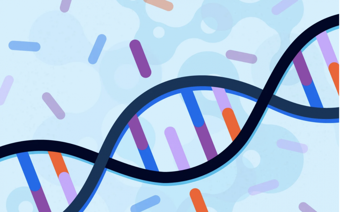
Here at Altheia Predictive Health, we analyze several factors when making disease predictions; one of these factors is family history and DNA markers which are parts of looking at genetic predispositions. Some companies dive deeper into DNA markers as a primary indicator for other conditions, such as how the BRCA1 gene relates to breast cancer in women. Similarly, genetics is now being used to understand if certain people may be at a higher risk of suffering serious complications from Covid-19 due to certain genetic expressions. Studies are also being conducted to understand if and how Covid-19 may change or mutate genetic expressions. In this article, we will take a look at some of the research being performed in this area.
Discussion
When it comes to looking at gene expression as it relates to Covid-19, researchers are not simply looking at who is most likely to test positive for the disease because many people are simply asymptomatic carriers. Rather, they are looking at gene expressions related to patients who have dealt with severe symptoms, or even passed away, as a result of Covid-19. A recent study published in the scientific journal, Nature Research, discussed a “genetic association study [that] identified a gene cluster on chromosome 3 as a risk locus for respiratory failure after infection with severe acute respiratory syndrome coronavirus 2.” The study went one step further and mapped this genetic expression to find that it was actually inherited from Neanderthals and “is carried by around 50% of people in south Asia and around 16% of people in Europe.”
Another study, out of the University of Edinburgh, went a step further to better understand the strength of impact this marker and found that “because 74% of patients [with the marker] were so sick that they needed invasive ventilation, it had the statistical strength to reveal other markers, elsewhere in the genome, linked to severe COVID-19; and that a single copy of the associated variant more than doubles an infected person’s odds of developing severe COVID-19.”
For those who survive a tough battle against Covid-19, as well as for those who test positive but are asymptomatic, the question remains of whether or not the disease can cause long term damage to our genes. Google recently granted researchers at the University of North Carolina – Chapel Hill $500,000 to study if and how Covid-19 alters gene expression. To conduct this research, researchers will “ compare RNA, a marker of gene expression, from the blood collected over years from the same individuals before and after COVID-19 infection [and]… use artificial intelligence tools to scan the genome for changes in gene expression that may be due to COVID-19 infection.”
Conclusion
Similar to many other health issues, our genetics can clearly play a huge role in how successfully we battle a disease such as Covid-19. What is promising about the research being conducted in this area is that once we better understand who is at the highest risk, we can better protect them and even create gene therapies to prevent severe symptoms or death due to Covid-19 for these people. However, just because you are not at risk of suffering from severe symptoms is no sign to put away your mask – Covid-19 has already been shown to have long term effects on those who test positive while asymptomatic and further studies will help us understand the severity of how the disease alters our genetic expression.