
This article focuses on a simple exponential regression fit to predict the day by day total cases of Covid-19 in the United States, as well as a discussion regarding how this will affect the American population given the worst-case scenario. We have also analyzed the number of hospital beds available at a county level and the capacity to handle these Covid-19 cases. There are a few sample states with county data in this article but we have published all 50 states at our website.
By Ayesha Rajan, Research Analyst for Altheia Predictive Health
Data, Analysis and Discussion
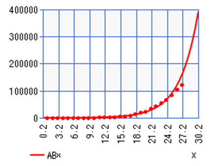
For data collection, I used Worldometer’s “Total Coronavirus Cases in the United States” graph, starting from March 2nd, to create the following table.
| Days | Dates | Number of cases |
| 1 | March 2nd, 2020 | 100 |
| 2 | March 3rd, 2020 | 124 |
| 3 | March 4th, 2020 | 158 |
| 4 | March 5th, 2020 | 221 |
| 5 | March 6th, 2020 | 319 |
| 6 | March 7th, 2020 | 435 |
| 7 | March 8th, 2020 | 541 |
| 8 | March 9th, 2020 | 704 |
| 9 | March 10th, 2020 | 994 |
| 10 | March 11th, 2020 | 1,301 |
| 11 | March 12th, 2020 | 1,630 |
| 12 | March 13th, 2020 | 2,183 |
| 13 | March 14th, 2020 | 2,770 |
| 14 | March 15th, 2020 | 3,613 |
| 15 | March 16th, 2020 | 4,596 |
| 16 | March 17th, 2020 | 6,344 |
| 17 | March 18th, 2020 | 9,197 |
| 18 | March 19th, 2020 | 13,779 |
| 19 | March 20th, 2020 | 19,367 |
| 20 | March 21st, 2020 | 24,192 |
| 21 | March 22nd, 2020 | 33,592 |
| 22 | March 23rd, 2020 | 43,781 |
| 23 | March 24th, 2020 | 54,856 |
| 24 | March 25th, 2020 | 68,211 |
| 25 | March 26th, 2020 | 85, 435 |
| 26 | March 27th, 2020 | 104,126 |
| 27 | March 28th, 2020 | 123, 578 |
The next step was to simply plug this information into a calculator which then provides two variables, “a” and “b”, such that the function can predict the total number of Covid-19 -19 cases by day. At the time, we have a= 73.5911229 and b= 1.328563895 and as each day goes on, we can add more data and improve accuracy. As such, we could expect the next few days to look something like this:
| Day | Date | Total Number of Cases |
| 29 | March 31st, 2020 | 278, 558 |
| 30 | April 1st, 2020 | 370, 082 |
| 31 | April 2nd, 2020 | 491, 678 |
| 32 | April 3rd, 2020 | 653, 226 |
| 33 | April 4th, 2020 | 867, 852 |
We could expect to see these numbers, but it is unlikely for reasons we will discuss below. Although it is great information for us to know on the national level, however, it is ultimately too broad to be actionable or even entirely accurate. Analysis at the state and county level can give hospitals a much more accurate idea of spread in each specific area. Exponential regression is very easy to do on a scientific calculator by simply plugging in inputs, x and y, as I did in the table above. There are also several online calculators with the same abilities. At that point, states can better prepare for demand for hospital beds and ventilators.
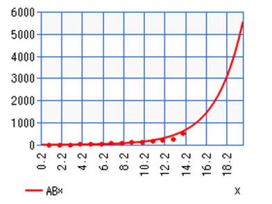
For example, let us look at New York which has been hit hard by Covid-19. If we set up the table as above for New York, we can see the following:
| Day | Date | Total Number of Cases (y) |
| 1 | March 4th, 2020 | 6 |
| 2 | March 5th, 2020 | 22 |
| 3 | March 6th, 2020 | 33 |
| 4 | March 7th, 2020 | 76 |
| 5 | March 8th, 2020 | 105 |
| 6 | March 9th, 2020 | 142 |
| 7 | March 10th, 2020 | 173 |
| 8 | March 11th, 2020 | 216 |
| 9 | March 12th, 2020 | 216 |
| 10 | March 13th, 2020 | 421 |
| 11 | March 14th, 2020 | 524 |
| 12 | March 15th, 2020 | 729 |
| 13 | March 16th, 2020 | 950 |
| 14 | March 17th, 2020 | 1,700 |
| 15 | March 18th, 2020 | 2,382 |
| 16 | March 19th, 2020 | 4,152 |
| 17 | March 20th, 2020 | 7,102 |
| 18 | March 21st, 2020 | 10,356 |
| 19 | March 22nd, 2020 | 15,168 |
| 20 | March 23rd, 2020 | 20,875 |
| 21 | March 24th, 2020 | 25,665 |
| 22 | March 25th, 2020 | 30,811 |
From this table, we find that in the format, a= 10.08977392 and b= 1.45480788. We can then make the same predictions we did on the national level at the state level. For comparison, let’s look at a different state – Alabama.
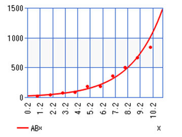
| Days | Date | Total Number of Cases (y) |
| 1 | March 13th, 2020 | 1 |
| 2 | March 14th, 2020 | 6 |
| 3 | March 15th, 2020 | 12 |
| 4 | March 16th, 2020 | 28 |
| 5 | March 17th, 2020 | 36 |
| 6 | March 18th, 2020 | 46 |
| 7 | March 19th, 2020 | 68 |
| 8 | March 20th, 2020 | 81 |
| 9 | March 21st, 2020 | 124 |
| 10 | March 22nd, 2020 | 138 |
| 11 | March 23rd, 2020 | 167 |
| 12 | March 24th, 2020 | 215 |
| 13 | March 25th, 2020 | 283 |
| 14 | March 26th, 2020 | 506 |
For this table, we find that in the format, a= 3.163963707 and b= 1.458356752. Compare these variables, a and b, to that of New York and look at Day 14 in either state – it is instantly clear the importance of making predictions at a more specific regional level.
However, there are flaws to this methodology; take a look at the graphs on the next page. I’ve also included graphs for Colorado, Missouri, Louisiana and Oregon for further comparison.
|
|

|
|
|
|

|
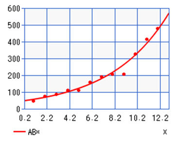
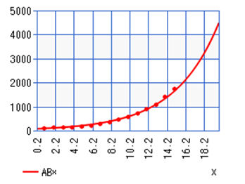
Looking at these graphs, we begin to see some issues in the use of exponential regression for prediction and the importance of recognizing that is a tool for predicting the worst-case scenario. What we can see here is that the most recent points for the United States and New York are beginning to stray away from the predicted exponential curve – this is a hopeful indication that precautions, such as social distancing and the closing of schools and non-essential businesses, are working and that the curve is flattening. However, if we look at Colorado, Louisiana, and Oregon we can see that there is much better fit to the exponential curve and that, at least for now, these states will likely see more benefit to using exponential regression than states where the curve is beginning to flatten.
With that in mind, it is important to adjust these predictive functions as new data becomes available to keep them as accurate as possible. If this trend seen in the graph of national cases continues, it will become more fitting to move forward with prediction using linear, rather than exponential, regression. It is also important to note that we are not necessarily seeing exponential growth in every area. For example, we can see in the graph for cases in Alabama that the points do not fit the exponential curve as well as the points mapped for national cases or cases in New York. This could mean that we are not yet at the point of exponential growth and will need to add more data each day to see a better fit; or that the spread in Alabama does not have the same rate of spread as in New York due to other factors, such as New York being more densely populated, having more visitors, etc.
The reason we used exponential regression for this article is because of the documented exponential nature of infection in Italy and China. While this method of prediction can work in the short term and help us allocate resources for the worst case, we should (and will in the next article) also look at daily rates of change and, likely begin to shift from exponential to linear regression to see a better fit.
As it stands, which hospitals are prepared for the incoming influx of patients and which hospitals will struggle to meet increased demand? To answer this question, we analyzed data at the county level using the same methodology as in our last as our last article in which we used Imperial College London’s prediction for cases with all, none and some precautions taken to prevent spread. We will attach our findings in a spreadsheet however, here is a sample of our data and some takeaways. For our example, we will look at Alabama again.
Supply vs Demand of Beds Available in Alabama – Worst Case Scenario
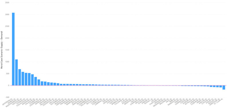
Fig 1: The above figure shows Supply minus Demand at peak when no precautions are taken to prevent spread. All counties appearing above the red dashed line have capacity, even at peak. All Counties at or falling below the red line are will not be able to meet demand. In this scenario, peak will hit mid-May. Planning for servicing counties that either do not have hospitals or have overburdened systems should be made. Some counties will have capacity to redirect to needed areas.
Fig 2: In the more likely scenario where some precautions are taken to flatten the curve, data suggests some counties will still be unable to meet the needed demand. The peak will hit in early June. Planning for servicing counties that either do not have hospitals or have overburdened systems should be made. Some counties will have the capacity to redirect to needed areas.
Supply vs Demand of Beds Available in Alabama – Most Likely Scenario
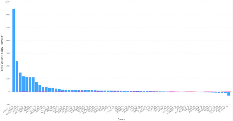
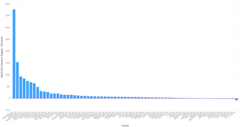
Fig 3: In the scenario where all precautions are taken to flatten the curve, data suggests almost all counties will be able to meet the needed demand. The peak will hit in June. Planning for servicing counties that either do not have hospitals or have overburdened systems should be made. Several counties will have capacity to redirect to needed areas.
Supply vs Demand of Beds Available in Alabama – Best Case Scenario
These figures give us a way to visually see which counties will be overwhelmed by the demand for beds amidst the Covid-19 Pandemic. They show us that there are many counties that can handle the demand if all preventative measures are taken but a large majority will be overwhelmed if weight is not placed on prevention. Our attached spreadsheet flags these counties given their level of preventative measures in place.
Conclusion
Using exponential regression as a prediction tool is efficient in a worst-case scenario. This is likely a more useful tool in areas that are densely populated and experiencing a high infection rate. We can use these predictions as a first step in an attempt to estimate the demand for beds for those with the highest risk, Americans aged 65+ with preexisting conditions. Once we know that, we can then look at numbers at the state and county level to see which hospitals will be overwhelmed by demand and require redirected resources. These are likely the last few days we can rely on exponential regression before switching over to linear regression as a more accurate and reliable tool.
As we concluded in our last article, we strongly believe that efforts to minimize infection rates such as closing schools, non-essential businesses, practicing social distancing, handwashing, etc., are key to preventing the overwhelming of hospital resources. Furthermore, we are including an attachment showing our predictions at each county level by the state for which hospitals are likely to see more demand than the available supply. It is our hope that this information can be used to funnel resources from hospitals with excess demand to those that will be overwhelmed by new patients.
In our first article, we reference a study from Imperial College London that will give us a better idea of which curve (i.e., some precautions, no precautions, all precautions taken) we are following. We will continue to compare this to new data as it surfaces. Finally, to circle back to our last article – once we have a predicted number of total cases at a smaller level, we can begin to predict the needs of those at a higher risk of being admitted to the hospital with preexisting conditions. From CDC data, we can anticipate that 30% of Covid-19 cases will be patients aged 65+. Of that population, we can utilize the data from CMS mentioned in our last article to anticipate medical device and physician demand for patients with preexisting conditions such as diabetes, heart disease, and COPD.
Citations
Covid-19 cases by day, USA:
“United States.” Worldometer, www.worldometers.info/coronavirus/country/us/.
Covid-19 cases by day, New York and Alabama:
Project, The COVID19 Tracking. “Most Recent Data.” The COVID Tracking Project, covidtracking.com/data/.
Demand vs Supply Charts: Created by author(s) using data from the CDC and census.gov